


Comtech Telecom | Virtumedix Telemedicine Service
Helping patients to schedule an virtual doctor appointment on Virtumedix
Virtumedix is a cross-platform virtual medicine product for clinics, insurance companies, pharmaceutical trials, pharmacies, and institutions.
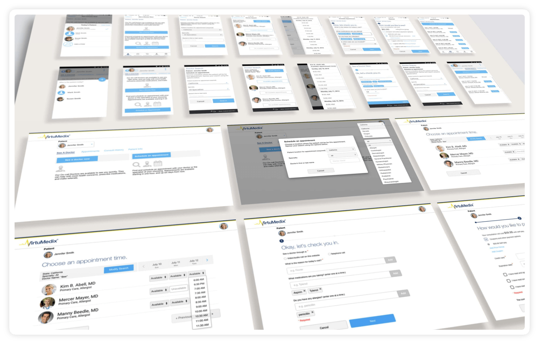
As the UX/UI design lead and information architect, I worked with Aliso Viejo, California's product and engineering teams. My job was to design a scheduling component for the application while improving the application's overall usability across all platforms.
After taking ownership of the Virtumedix UX in late 2016, I worked with the product, engineering, and sales team leads to upgrade the UI and design a new foundation for scheduling appointments into the system.
Design the scheduling component
We started with an undefined Scheduling feature request that might significantly impact the overall application experience. First, I wanted to understand what features the scheduling component required to be effective for the user.


Specialist Value
I soon learned that specialists require scheduling and that generalists do not. Our primary goal thus became matching available specialists to the patient. A secondary objective would allow patients to search for their generalist doctor by name.
Scheduling systems for Patients
Here I discovered the complexities of 3rd party scheduling components.
3rd party scheduling systems for patients were complex and inflexible. They did not match the patient experience we were creating.
Doctor schedules
To understand specialist availability, I familiarized myself with some of the doctor groups' scheduling systems at the time. All were complex, expensive, and highly customized for each physician group. We quickly determined this was outside of our objective scope. Instead, we would build a solution that worked for all our physician groups.
Competition Analysis
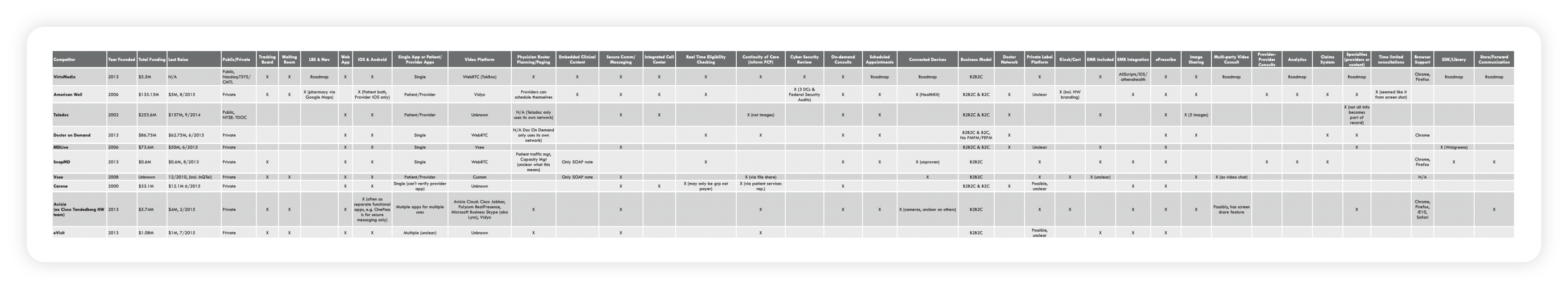
Competition
Doctor On Demand
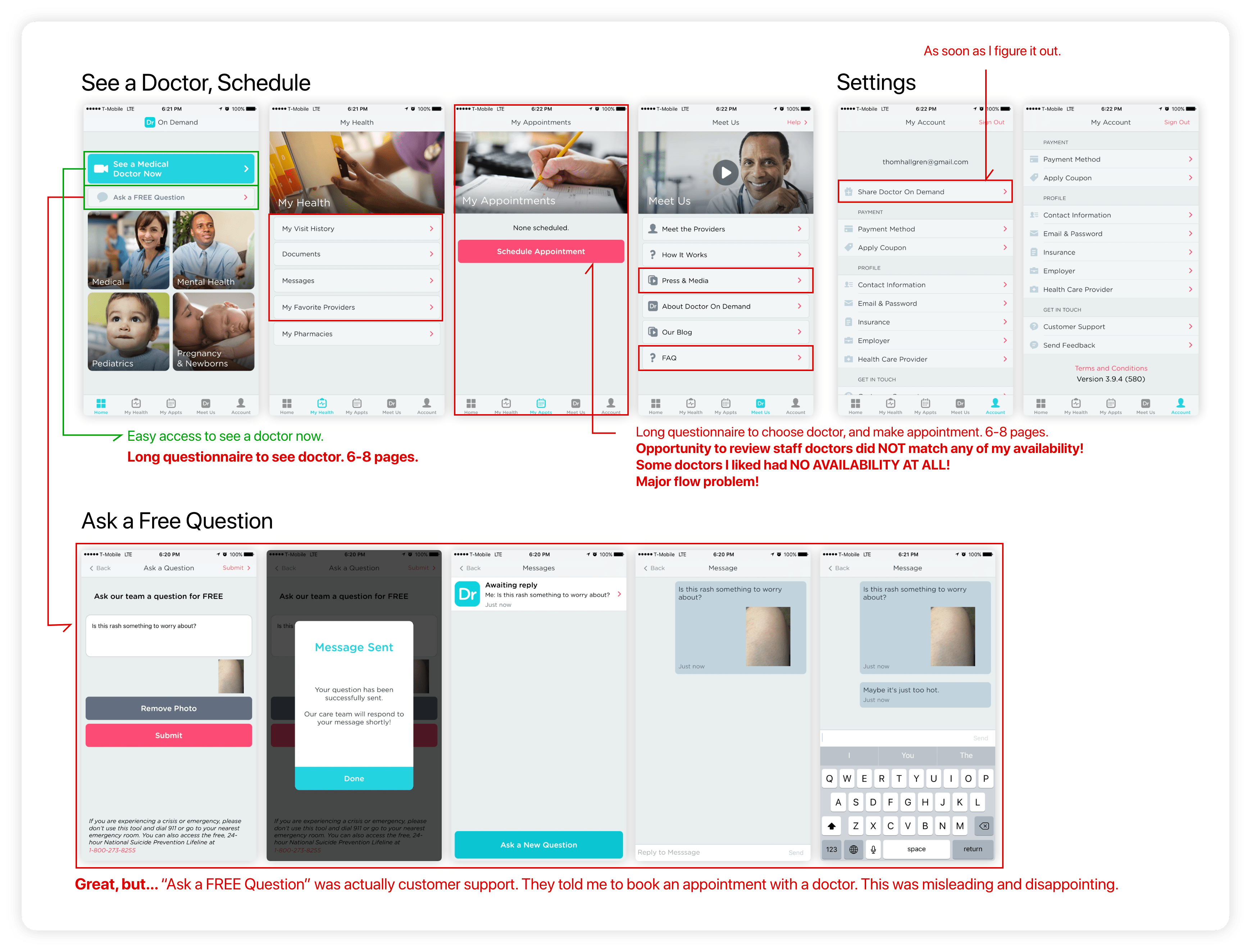
Doctor On Demand Discoveries
Pros - threats
• Massive funding: $75MM+
• See a medial doctor now option (like Virtumedix)
• Building framework and foundation for more significant businesses (with more doctors and groups)
• Relationships with major health companies
• Major Group Types in one app: Medical, Mental, Pediatrics, Pregnancy & Newborns
Cons - can we improve upon
• One-Size-Fits All App not congruent with diverse medial groups and practices.
• Not enough local doctors to fill the calendar or queue.
• See a Doctor Now / Schedule Appointment flow had a long questionnaire.
• FREE Chat did not connect with a doctor.
• Press, Media, Blog, FAQ, About are not necessary in an app.
• No cash option. Required an insurance provider account
Though well funded with scheduling components, our competitors were not doing scheduling well at the time. Neither Doctor On Demand, nor Teledoc, made the process easy to use.
This competitive analysis helped me understand our potential competitive advantage: Scheduling a Specialist Quickly and Easily.
Hipmunk
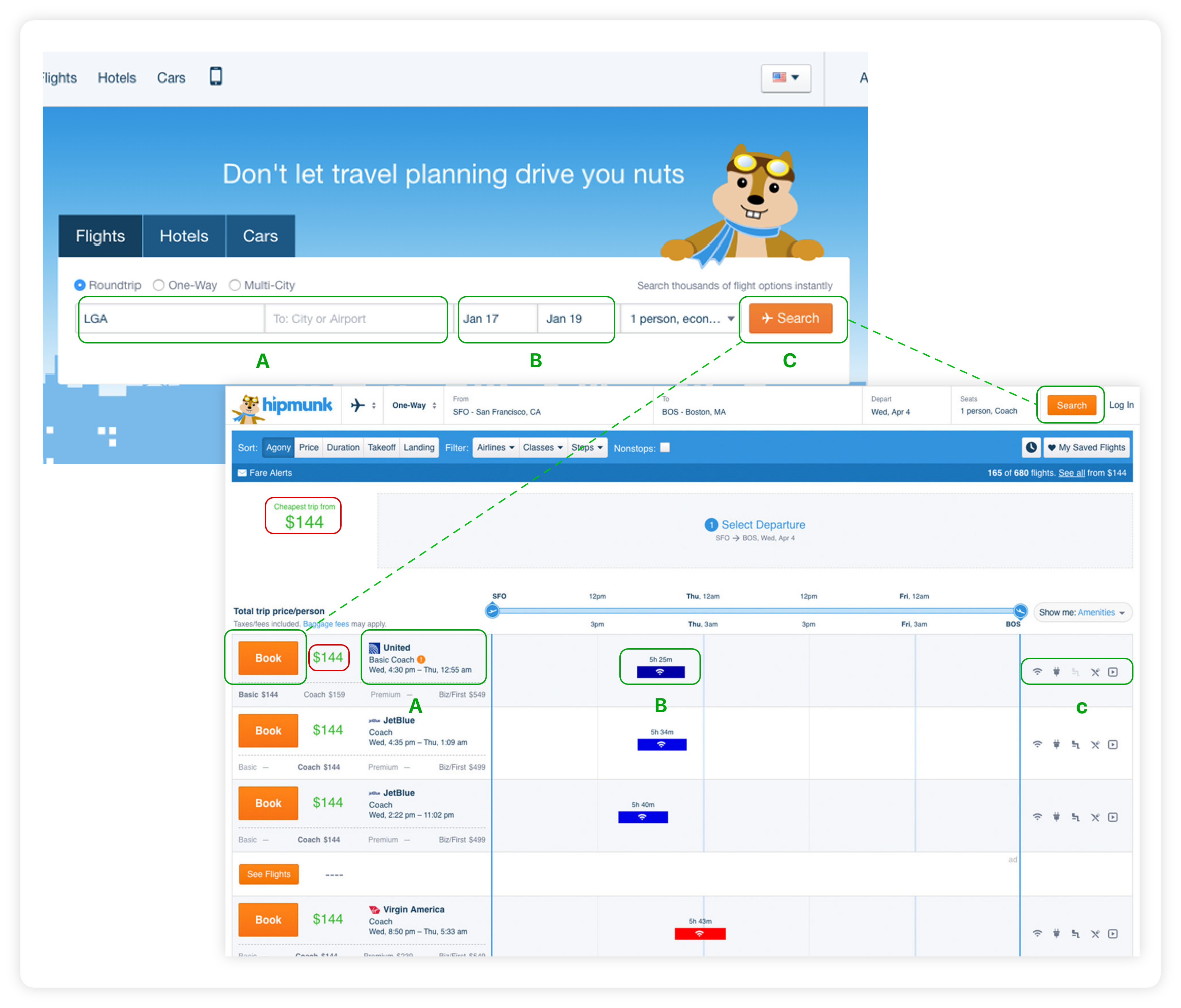
Influential Learnings
A: Clear departure and destination and date
B: Available times
C: Search, then Book based on available results.
Note: If users could not act on the results offered, the option to revise the search is presented consistently as an orange "Search" button on the results page, like on the start page.

Similarities and differences
Similarities:
A: High-cost future, potentially stressful "appointments."
B: Requires decisive action by the user.
C: Fulfill a custom need (destination/time or specialist/availability)
Differences:
A: Airlines tend to book further in advance.
B: Airlines require departure, destination, date, and "Search."
C: Specialists require specialty, patient state (i.e., CA, TX), and "Search."
Seeing such potentially a complex scheduling feature, like booking flights, executed so easily made the idea of scheduling a physician seem like a walk in the park!
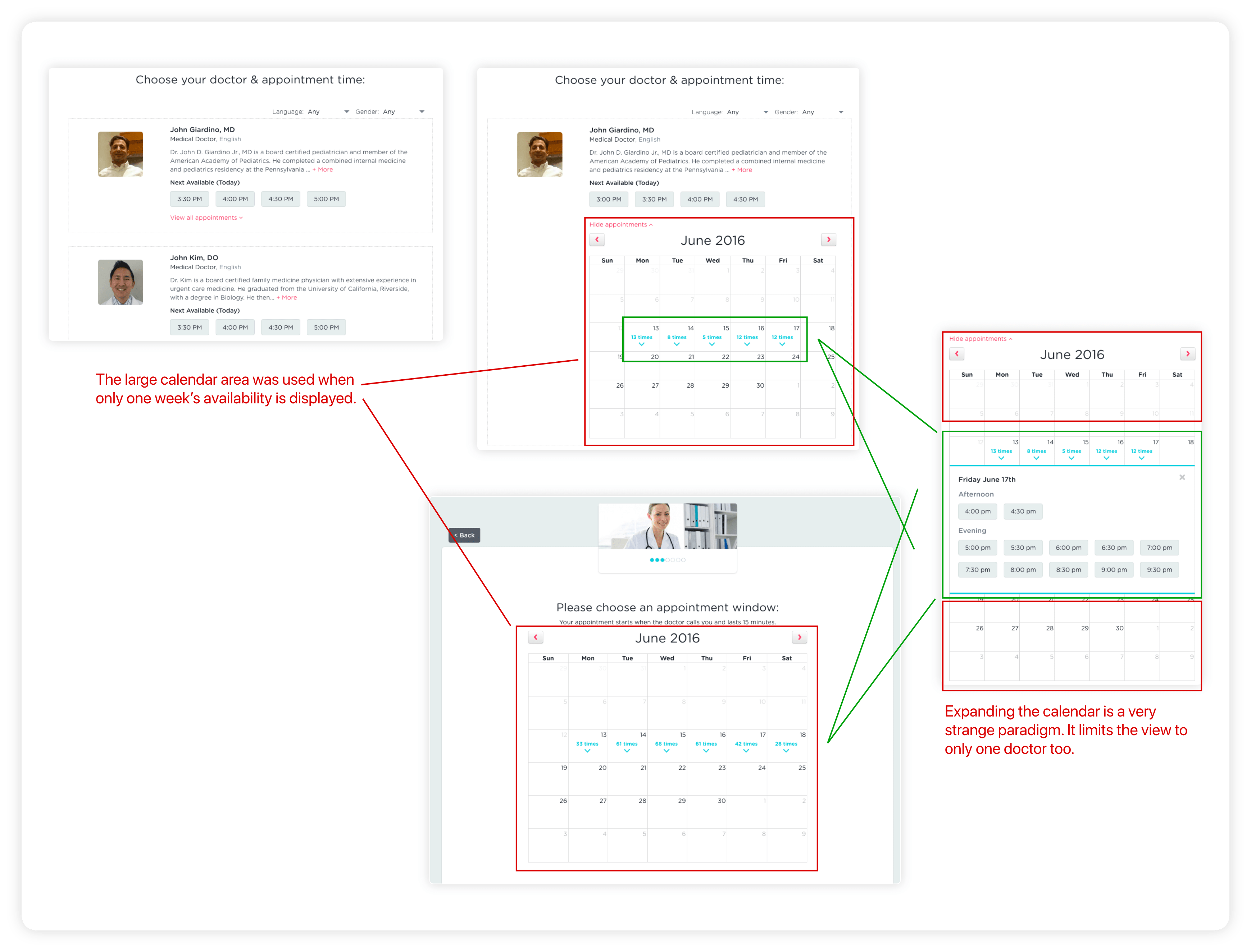
Exploratory design and user testing with monthly calendars

Initially, the physician groups requested that we begin by show patients a two-month availability schedule for each specialist. The request was understood, designed, and tested for understanding.
Here is what we learned:
• Monthly-calendar views led to decision fatigue
• Booking more than a few days in the future was not the goal.
• Users wanted to see a doctor of their choosing "ASAP."
• The large calendar confused users. "Does this connect to my computer calendar?"
• Users described telemedicine as a "fallback" to visiting their doctor in their office.
A design that worked
The new design created a bias toward action. Patients could find a specialist, a time, and book it with just a few clicks.

The Patient and Doctor user flows
The whole system was easy to diagram for the engineering team.

Design prototype testing
With a solid concept, I set about prototyping the whole system. I then leveraged the knowledge and experience of our QA teams. They were very good at finding obstacles and inconsistencies with the existing system.

I then began prototype testing with users in different parts of our office. All of these real-world users found the prototype very easy to use. They liked the direct action, reduced options. Each had experience booking doctors on the systems of our larger competitors. Since the process was simple, user testing was often brief.
Outcomes and learnings
Scheduling a specialist is now simple for patients. What took dozens of clicks in our competitors' apps now took six to ten on Virtumedix. Also, our scope reduction sped up the release date by several months. Patients of all ages found it easy to book and see a doctor.
Business outcomes: Corporate conducted an outside Business review. Virtumedix came in as the #1 in the industry for ease of use and speed in scheduling a doctor appointment. Based on the final scheduling version, six new clinics purchased white-label versions of the system over the next eight months.
Respect the user bias to action
We attempted to begin with a calendar that created relatedness to a user's calendaring software in early iterations.
While testing our prototypes, we found that simplified design often goes hand in hand with obvious and straightforward terminology and minimal instruction—users in testing scheduled appointments more quickly when the flow supports it. Options tended to interrupt this bias and, at times, lead to abandonment.
Being responsible for crafting functional systems from scratch reminds me that ongoing research, reductive thinking, and questioning the details through the process are essential. Listening to users and watching what they do lead us to the final design solution.
WORK
- Comtech Telecom | Virtumedix Telemedicine Service
Architecture, UX and UI design, cross-platform - Block.one | Blockchain Lexicon Research Project
UX research project to address terminology confusion around blockchain - Block.one | Money Blockchain Mobile Token App
Research, Architecture, UX and UI for a secure cryptographic transfer application - Block.one | EOSIO iOS Blockchain Authenticator App
Researcher, Architecture, UX design for iOS application - Block.one | Voice Social Blockchain App
Research, Architecture, and UX design - Block.one | Digital Blockchain Identity Project
Research, documentation, design, product validation for intellectual property and patent filing - Solana Defi Margin Trading Module Web App Design
Product design, UI, and prototype challenge for Solana blockchain - Fiinex | Marono iOS Fashion App
User experience, architecture and UI design for a fashion news application for the Japanese market - Collabworks | Improving Work at Qualcomm
Information graphic design, UX and UI design - Fiinex | Maserati Japan - iPad App for New Car Buyers
Product design, iPad application, UX and UI design for drivers to better understand their cars and the community  Fiinex | Kepler | Binnacle Design Experiment
Research and UX/UI design exploration for a new hybrid sports car company. AUDI Japan. UX Tablet
Product design, iPad application, UX and UI design for Audi car buyers in Japan. Fiinex | TappnGo
Research, Information Architecture, UX design, and product naming recommendations for a new patented video advertising unit.